Before PowerPoint was developed, most presentations were made within departments that shared common knowledge sets. With a changing work environment in the 60s and 70s came a need to clearly communicate between departments. A simple, illustrated guide was needed to organize and share information. The outcome was the presentation medium of 35mm slides, followed by less-expensive transparencies. PowerPoint 1.0 officially went on sale in April, 1987. The program was then Macintosh based, and produced black-and-white slides that a photocopier could print as overhead transparencies.
As technology evolved, PowerPoint became colorful and streamlined into Windows Office. Microsoft now estimates that at least thirty million PowerPoint presentations are made daily.
According to Ian Parker of The New Yorker, “after Microsoft’s… dizzying growth, there are great tracts of corporate America where to appear at a meeting without PowerPoint would be unwelcome and vaguely pretentious…”
So consider the following tips to get your point across:
- Simple is best. Steer towards clean templates, and avoid animations and unnecessary sound effects.
- Use a title that captures an audience’s attention. Draw viewers in with a bold statement that engages them to listen to your message.
- Clip art is passé. Avoid it at all costs. If you need more visual appeal, use a photograph, as long as it’s relevant to the content.
- The “Rule of Seven” shouldn’t be a rule. “Seven (7) bullets or lines per page, seven (7) words per line” has been a rule of thumb for years, but is too formulaic. Keep your font a good, legible size (no less than 18pt) and keep your verbiage simple.
- One topic per page. Again, keep it simple. Too much information is confusing and difficult to follow. PowerPoint is used to summarize your presentation; each slide should be read and comprehended in 10 seconds or less.
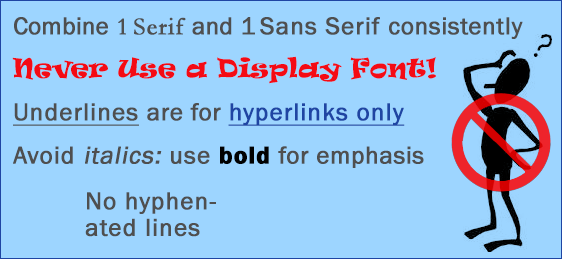
- Put your best font forwards. Bold for is for emphasis, avoid italics. Underscored text is only for hyperlinks. No hyphenated lines. Use no more than two complementary fonts for your presentation. One sans serif and one serif work nicely. Do not use a display font.
- Titles should be short, in title case. As recommended by the U. S. Government Printing Office Style Manual, “Capitalize all words in titles of publications and documents, except a, an, the, at, by, for, in, of, on, to, up, and, as, but, it, or, and nor.”
- Master your formatting. The best way to keep a presentation consistent is to use the master pages, and use the same palette of colors throughout.
- Avoid triple delivery. Having precisely the same text on the screen, spoken aloud, and printed on the handout is too much redundancy. Don’t let the viewer read ahead of you. Present supporting material rather than reading your bullets verbatim. If you must print, include the “notes.”
- Squishing photos is cruel. Hold down the SHIFT key while scaling photos and graphics. Inappropriate resizing looks extremely amateurish.
Want to read more tips? View Death by PowerPoint by Fadi-Pierre Singer.
Find out more of PowerPoint’s history by reading Ian Parker’s Absolute PowerPoint: Can a software package edit our thoughts? from the The New Yorker’s 2001 Annals of Business.


